Case Study: Cameron Art Museum
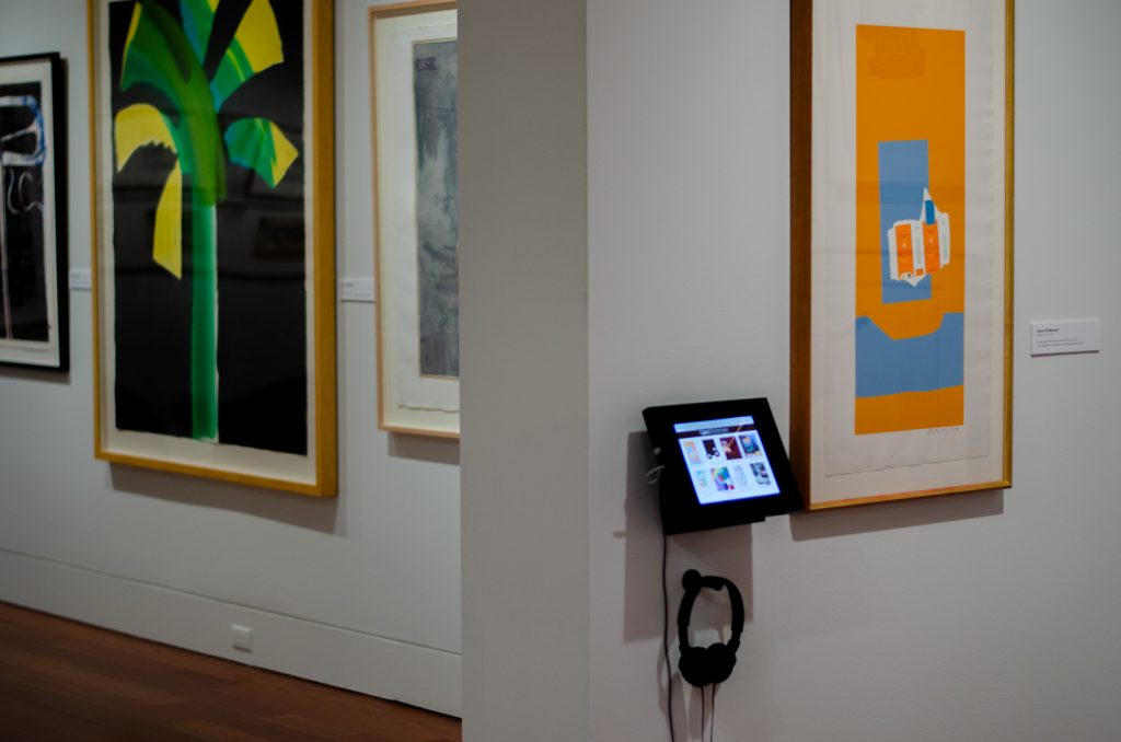
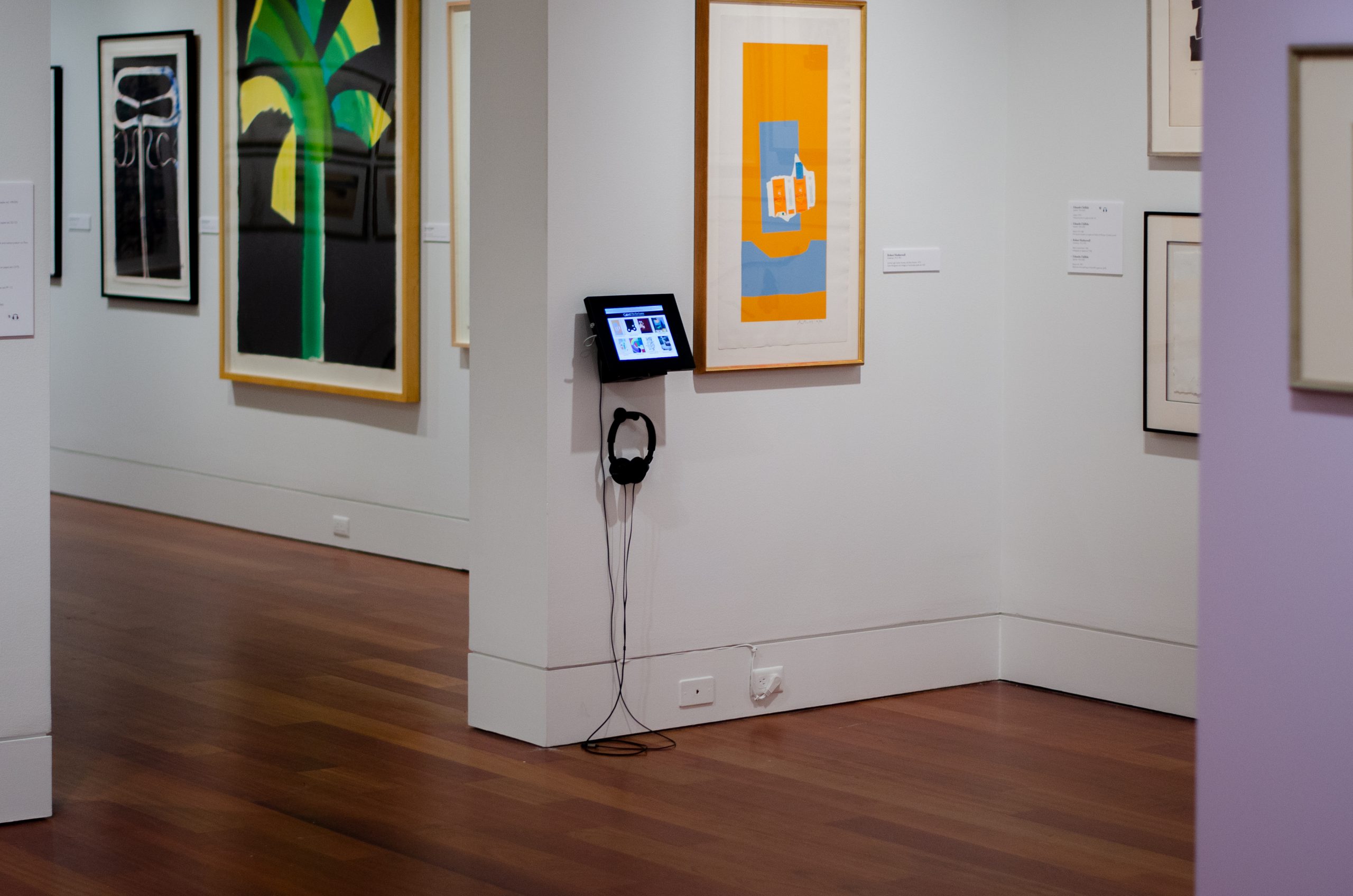
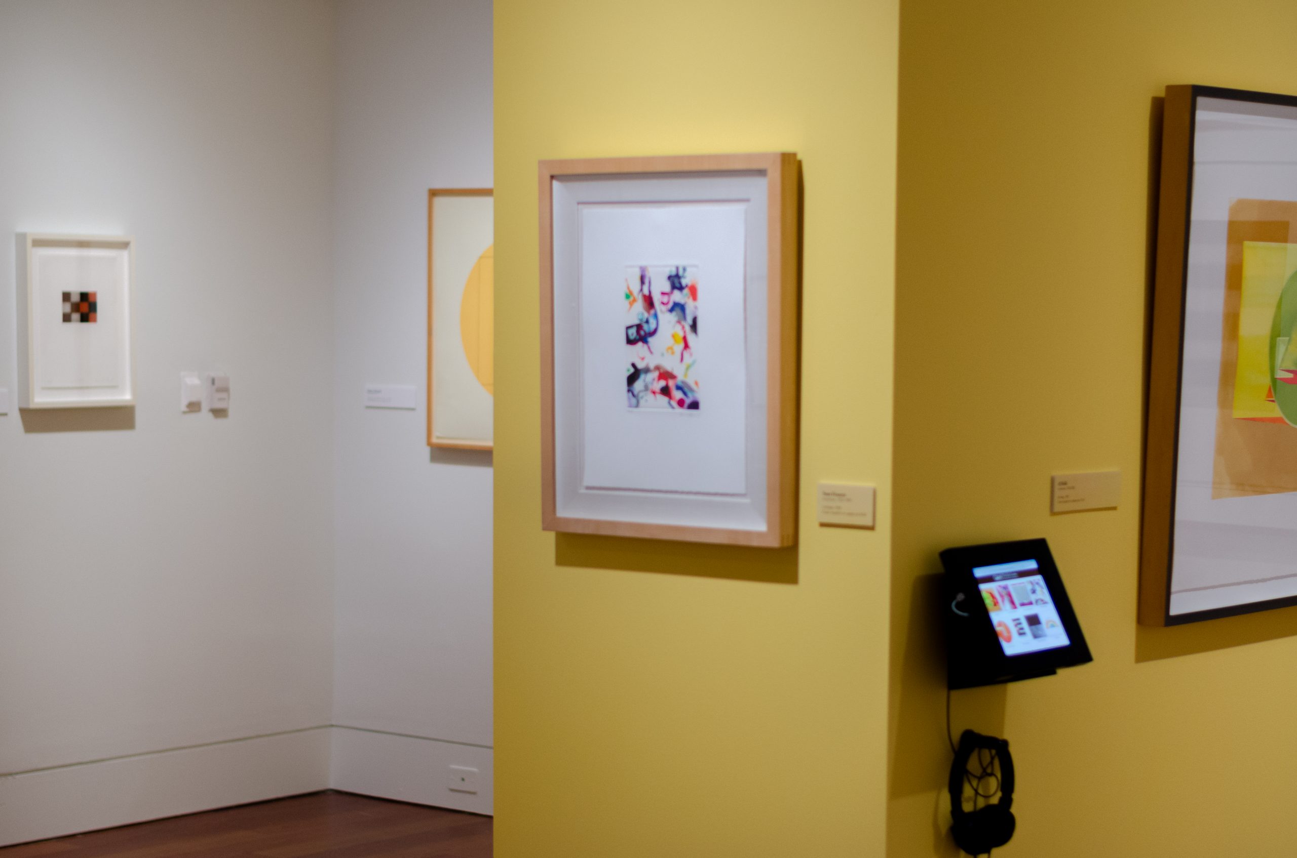
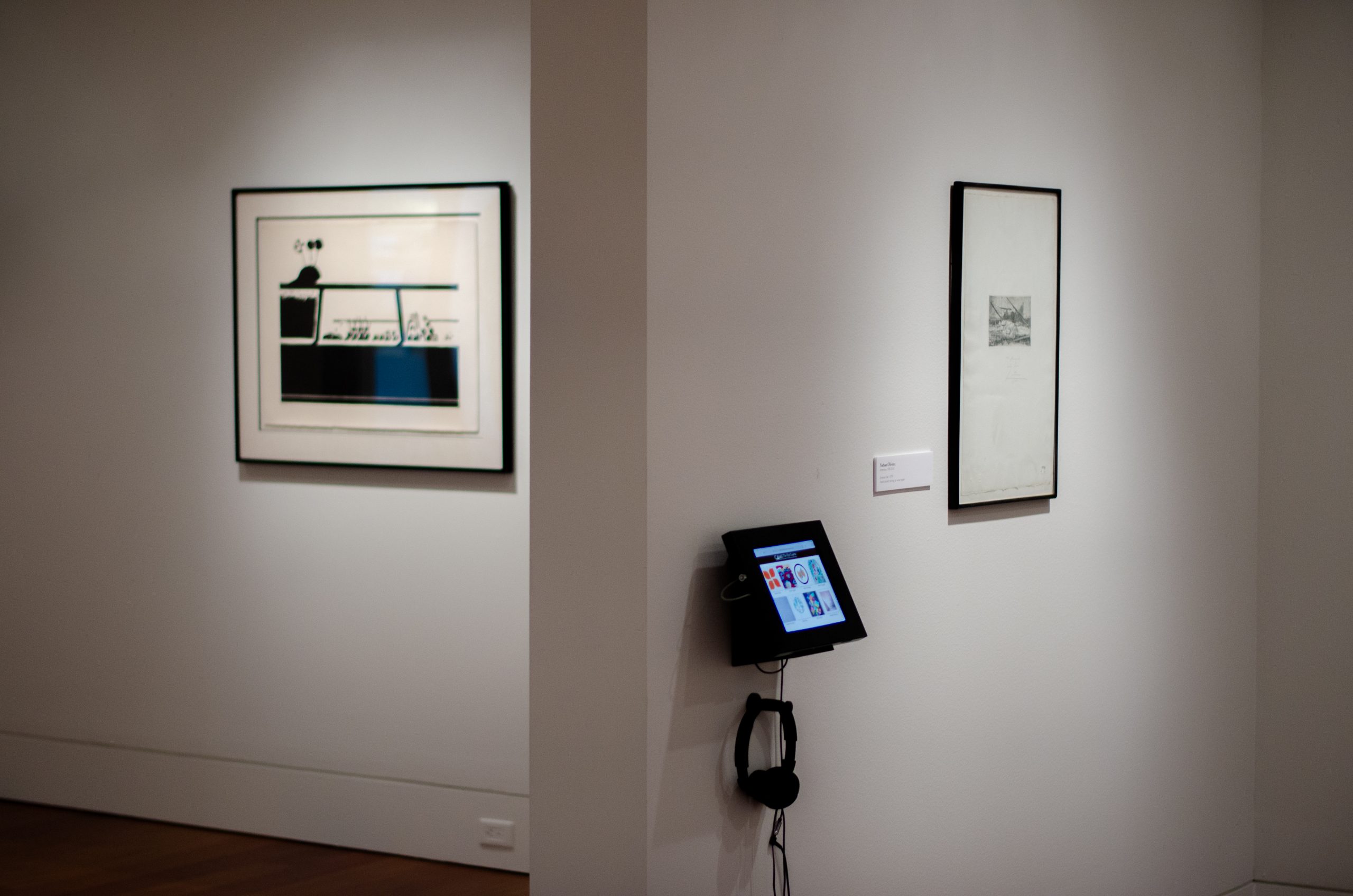
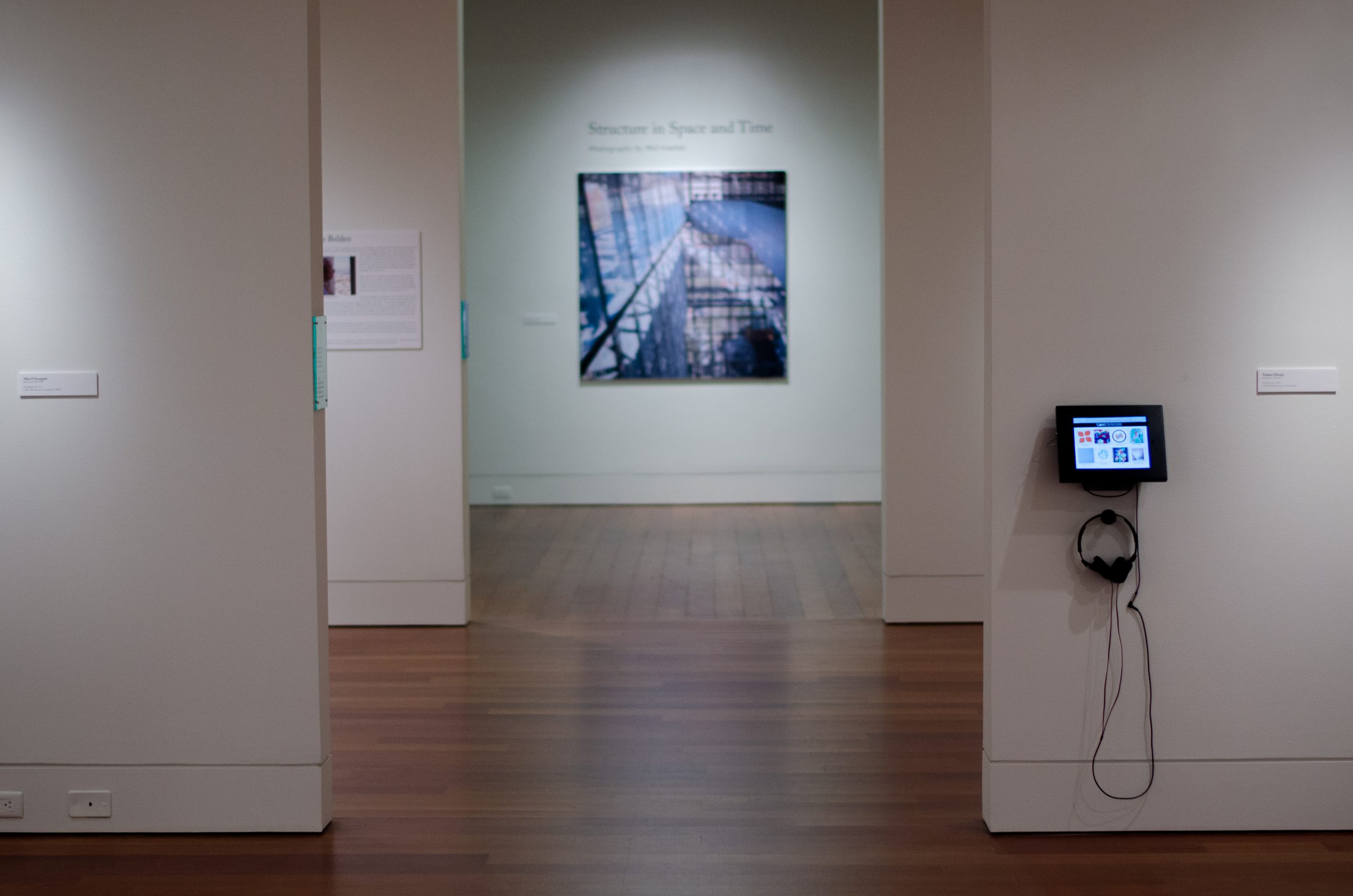
When I heard the Cameron Art Museum needed help with adding coding to one of their upcoming galleries, I jumped at the chance. I had always loved visiting on school field trips, and this would be my second opportunity to have my “work” in an art gallery. Click here to jump straight to a demo of one of the interactive displays.
Background
The internet provides more access to global resources today than ever before. An unfortunate consequence to this is that people are relying on digital replications of media, rather than appreciating it in its original form. While this may save resources in some areas, it is also affecting museums, bookstores, and theatres. To combat this problem, such locations are adapting by adding special effects, interactive displays, and other features that this new digital-first generation has come to expect.
Museums, in particular, are incorporating more and more interactive and digital components to bring fine art to life for their guests.
The Cameron Art Museum (CAM) is no stranger to interactive exhibits. One of their upcoming exhibits, “The Eye Learns: Modernist Prints from the Louis Belden Collection,” is comprised of fine art prints from several dozen artists. CAM’s gallery has a very modern aesthetic for displaying their modernist prints; however, “modern” can sometimes be viewed as “cold,”–the exact opposite of a welcoming attraction–and they knew they needed some additional elements to bring the exhibit to life.
Experience Mapping
Without interactive displays, visitors’ experiences would be limited. Upon entering the gallery, they would stop and admire the artwork and then move on to the next piece. If they had a museum guide, they may ask questions pertaining to a certain piece. If they were really invested they may even look up the artist to get a bit of background on the work or the master themself.
With the interactive displays, CAM did not want to disturb those who prefer the quiet wanderings through the galleries, but enhance the experiences of those who wish to know or see more. They wanted an easy-to-use layout where users could click on an artist’s thumbnail image and bring up a video of the artist themself or, at the very least, a video of someone who specializes in the late artist’s work.
User Personas
If you go to an art museum and people-watch, rather than admire the artwork on display, you will find that there are four main personas that walk through those front doors: art enthusiasts, students, families, and retirees. Some people may fit more than one persona. Not all of them come for the same reason, but the goal is to have each feeling more enriched when they leave.
Art Enthusiasts
Every art museum dreams that every person who comes through their front door falls under this persona–or at least leaves as one! Art enthusiasts come in all demographics and may follow a particular artist, style, or culture. Or, they might simply enjoy all forms of art. No matter their preference, their goal is to experience as much as they can during their visit.
Students
Regardless of the age of the student, this persona is here for one reason: to learn. Sometimes it’s for a mandatory field trip, but most of the time it’s to observe and gain inspiration from the greats. For the former group, having interactive activities helps mitigate boredom and limits horseplay. For the latter, there’s no better source of wisdom than from the artists themselves, or at the very least from professionals who specialize in the late artists’ works.
Families
Family groups that come to an art museum are typically young families, or at least those with school-age children. The parents might be using this simply as an outing so they don’t go stir-crazy at home, or they may be trying to expand their children’s cultural awareness. Whatever the case, any interactivity has to be both simple and durable enough for a supervised child.
Retirees
People in this persona may very well also be an Art Enthusiast or a Student, but need their own category as they usually have their own demographic. While there are the outlying retirees that were able to afford retiring when they were young, this persona caters to those who traditionally retired and are in their 60’s or later. Why single this demographic out? Because they come from a generation that wasn’t centered on technology. They may not be very familiar with it and might prefer quietly walking through the galleries, as they’ve done for decades.
Designing with the Users in Mind
In order to create a clean design that complimented the gallery’s modern aesthetic, I chose to go with a simple white and black layout. CAM had requested using a featured piece from each artist as their respective thumbnail, and I wanted to let the artists’ colors pop without drawing attention away via additional colors. The bright colors would grab the attention of younger Students and Families, with a layout simple enough for the youngest user or a Retiree still getting used to technology. The contrasting black header helped emphasize both the museum’s and the exhibit’s names, while simultaneously blending in with the display’s edges enough to not be too much of a distraction.
Accessibility
Regardless of their persona, we wanted to make the interactivity as accessibility-friendly as possible.
While the color combinations were made to be aesthetically-pleasing, the contrasting colors were meant to help those with visual impairments interact easier. Additionally, the white background helped make the stationary iPads glow brighter in the low gallery lighting than a black background ever would have.
Headphones were provided with the iPads so the videos’ volume could be adjusted to the user’s comfort, without disrupting others in the gallery. While embedding YouTube videos required the tablets to remain connected to the internet, YouTube’s player controls both allow for customization of video speed and closed captioning. Yes, the auto-generated closed captioning sometimes has issues, but that’s a topic for another blog post.
Demo:
WARNING: Videos are on auto-play (in case you’re viewing this in a quiet area).
DISCLAIMER: The aesthetic of this interface was meant for a tablet, displaying the artists in two rows of four. A responsive aesthetic was never needed when live, and thus was not factored in. If you’re viewing this on a smartphone, the responsive layout may kill the aesthetic, but you will still have the functionality.


Nobu Fukui
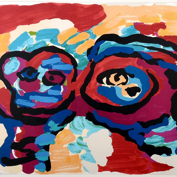
Karel Appel
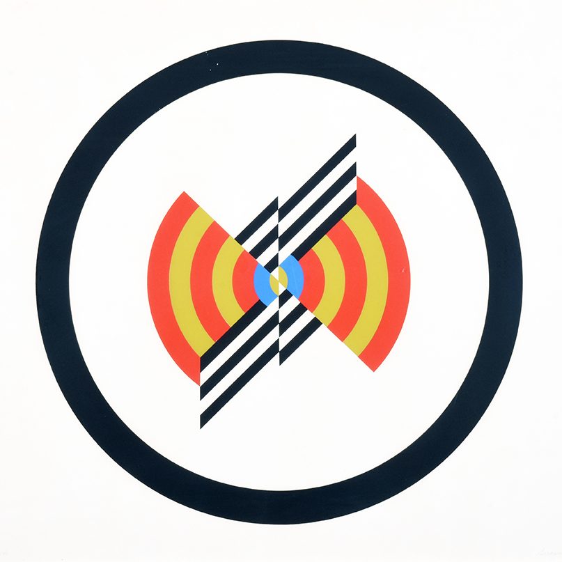
Judy Chicago
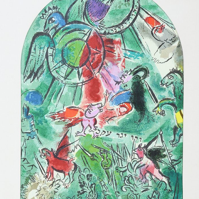
Marc Chagall

Louise Nevelson
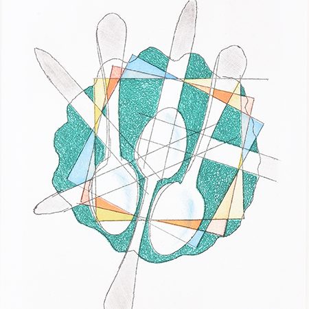
Man Ray
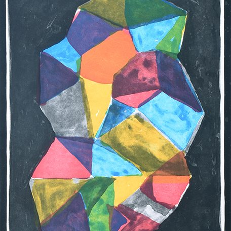
Sol LeWitt

Nathan Oliveira
In Action
The museum received great feedback when it came to the interactive iPads. The younger Students and Families loved being able to control and actively participate in the learning.
There were no issues with usability, as it was designed to be user-friendly. The only hurdle we found was making sure we had everything connected correctly to their network. A few calls with IT and some brief Googling helped solve the problem.
Overall, our partnership was a huge success and I’m honored to have my own “work” displayed next to those of prominent artists.
